오늘은 Python에서 사용되는 세 가지 시각화 도구인 Matplotlib, Seaborn, Altair를 중점으로 배워보았다. 처음에는 단순 막대그래프에서 시작했지만, 점점 라인그래프, 파이차트, 피라미드차트, 이중축 그래프 등 다채로운 시각화를 해보면서 데이터를 눈으로 이해하는 법에 대해 배워볼 수 있었다.
오늘도 마찬가지로 먼저 분석에 필요한 라이브러리와 서로 다른 csv 파일 여러개를 불러온 뒤, 실습에 들어갔다.
#pip install matplotlib

import pandas as pd
import numpy as np
import time
from PIL import Image

import altair as alt
import seaborn as sns
import matplotlib.pyplot as plt

# seaborn 팔레트 설정
palette = sns.color_palette("pastel")

import warnings
# 오류 경고 무시하기
warnings.filterwarnings(action='ignore')


# csv 파일 불러오기
df = pd.read_csv("product_details.csv")
df2 = pd.read_csv("customer_details.csv")
df3 = pd.read_csv("E-commerece sales data 2024.csv")
Matplotlib(pyplot)는 가장 기본적인 시각화 도구이고,
Seaborn은 Matplotlib 기반의 "예쁜 스타일 라이브러리,
Altair는 인터랙티브 즉, 움직이는 차트를 제작할 수 있는 도구이다.
1️⃣ 데이터 시각화 - Matplotlib
1. 기본 그래프
성별에 따른 유저 수를 빠르게 비교하기 위해 막대그래프를 그려보았다.
# 데이터 전처리 (결측치 제거)
df2 = df2.dropna()

# 그래프 그리기
df2.groupby('Gender')['Customer ID'].count().plot.bar(color=['pink','green'])- groupby로 Gender별 고객 수 집계
- plot.bar( )로 막대그래프 생성
- color로 막대 색상 직접 지정
2. 라인 그래프 그리기
카테코리별 사용자 수를 선형 흐름으로 파악하기 위해 라인 그래프를 그려보았다.
d1 = df2.groupby('Category')['Customer ID'].count().reset_index()

# 그래프 그리기
dplot1 = plt.figure(figsize = (10, 3))

x = d1['Category']
y = d1['Customer ID']

plt.plot(x, y, color='purple', marker='o', alpha=0.5, linewidth=10)
plt.title("Group by category - user count")
plt.xlabel("Category")
plt.ylable("User count")- figsize : 그래프 크기
- marker : 데이터 포인트 표시 (* → ★ / ^ → ▲ / ...)
- alpha : 투명도
- linewidth : 선 두께

3. 막대그래프 + 피벗 형태
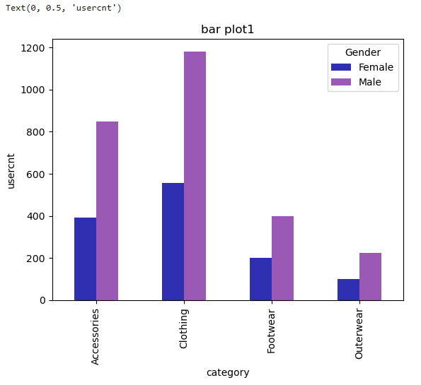
카테고리별, 성별 유저 수를 한눈에 비교하기 위해 다음 형태의 그래프를 그려보았다.
d2 = df2.groupby(['Category','Gender'])['Customer ID'].count().unstack(1)

# 그래프 그리기
dplot8 = d2.plot(kind='bar',color=['#2F2FB1','#9b59b6'])
plt.title("bar plot1")
plt.xlabel("category")
plt.ylabel("usercnt")
unstack( )을 이용해 Gender를 컬럼으로 펼친 후 그래프를 그렸다.
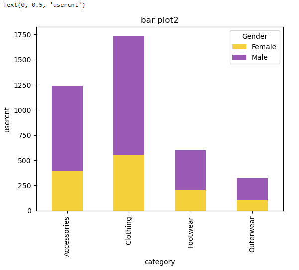
4.누적 막대그래프
# 그래프 그리기
dplot9 = d2.plot(kind='bar', stacked=True, color=['#F4D13B','#9b59b6'])
plt.title("bar plot2")
plt.xlabel("category")
plt.ylabel("usercnt")
stacked = True 옵션만 넣으면 바로 누적형 그래프가 된다.
5. 파이차트
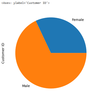
파이차트는 전체 비중을 표현할 때 유용하다.
piedf = df2.groupby('Gender')['Customer ID'].count().reset_index()

# 그래프 그리기
dplot7= plt.figure(figsize=(7,7))
plt.pie(
    x=piedf['Customer ID'],
    labels=piedf['Gender'],
    autopct='%1.1f',
    colors=['red','#9b59b6'],
    startangle=90
)
plt.legend(piedf['Gender'])
plt.title("pie plot", loc="center", pad=10, fontsize=10, fontweight="bold")
plt.show()- autopct : 퍼센트 표기
- startangle : 시작 각도 조절

6. 산점도
변수 간 관계(나이 vs 평균 구매금액)를 직관적으로 확인해보기 위해 산점도를 그려보았다.
d3 = df2.groupby('Age')['Purchase Amount (USD)'].mean().reset_index()

# 그래프 그리기
plt.scatter(d3['Age'],d3['Purchase Amount (USD)'], c="purple")
plt.title("Scatter graph", loc="center", pad=10, fontsize=10, fontweight="bold")
7. 이중축 그래프
두 개의 서로 다른 scale을 가진 데이터를 동시에 비교하고 싶을 때 이중축 그래프를 그려볼 수 있다.
plt.style.use('default')
plt.rcParams['figure.figsize'] = (4, 3)
plt.rcParams['font.size'] = 12

x = np.arange(2020, 2027)
y1 = np.array([1, 3, 7, 5, 9, 7, 14])
y2 = np.array([1, 3, 5, 7, 9, 11, 13])
두 축(twinx)을 활용한 코드는 다음과 같다:
fig, ax1 = plt.subplots()

ax1.plot(x, y1, color='green', linewidth=5, alpha=0.7, label='Price')
ax1.set_ylim(0, 30)
ax1.set_ylabel('Price ($)')
ax1.set_xlabel('Year')

ax2 = ax1.twinx()
ax2.bar(x, y2, color='purple', label='Demand', alpha=0.7, width=0.7)
ax2.set_ylim(0, 18)
ax2.set_ylabel(r'Demand ($\times10^6$)')
두 그래프가 겹칠 때 z-order로 어떤 그래프가 먼저 나올지 즉, 앞/뒤 순서 조정을 할 수 있다.
ax1.set_zorder(ax2.get_zorder() + 20)
ax1.patch.set_visible(False)
8. 피라미드 그래프
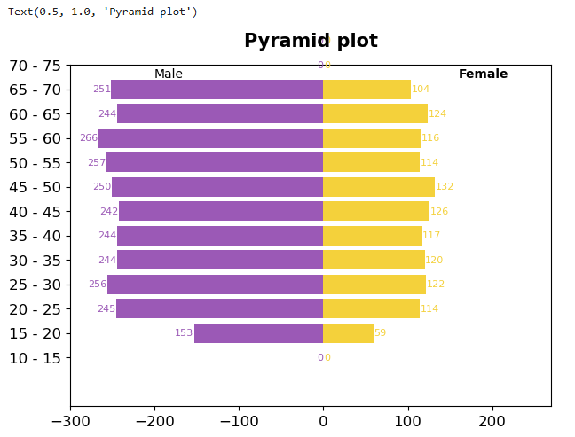
인구통계에서 자주 볼 수 있는 형태인 피라미드 그래프를 활용해 남녀 인구를 나이대별로 파악할 수 있는 그래프를 그려보았다.
1) 나이대 구간 만들기
# 나이대 구간 나누기
bins2 = [10, 15, 20, 25, 30, 35, 40, 45, 50, 55, 60, 65, 70, 75, 80]
df2["bin"] = pd.cut(df2["Age"], bins = bins2)

# 보기 쉽게 구간 정리
df2["age"] = df2["bin"].apply(lambda x: str(x.left) + " - " + str(x.right))
2) 구간별 성별 인구 수 계산 후 대칭 구조 만들기
df7 = df2.groupby(['age','Gender'])['Customer ID'].count().reset_index()
df7 = pd.pivot_table(df7, index='age', columns='Gender', values='Customer ID').reset_index()
3) 피벗으로 가로 형태로 펼치기
df7 = pd.pivot_table(df7, index='age',
                     columns='Gender',
                     values='Customer ID').reset_index()
4) 좌우 대칭 구간 생성
df7["Female_Left"] = 0
df7["Female_Width"] = df7["Female"]
df7["Male_Left"] = -df7["Male"]
df7["Male_Width"] = df7["Male"]- Female_Left = 0 : 오른쪽만 표시
- Male_Left = - (남성유저수) : 왼쪽으로 음수 방향 표시
5) 막대 그리기
dplot6 = plt.figure(figsize=(7,5))

plt.barh(y=df7["age"], width=df7["Female_Width"],
         color="#F4D13B", label="Female")

plt.barh(y=df7["age"], width=df7["Male_Width"],
         left=df7["Male_Left"],
         color="#9b59b6", label="Male")


plt.xlim(-300,270)
plt.ylim(-2,12)
plt.text(-200, 11.5, "Male", fontsize=10)
plt.text(160, 11.5, "Female", fontsize=10, fontweight="bold")


# 막대 위에 숫자 작성하기
for idx in range(len(df7)):
    # 남성 데이터 텍스트로 추가
    plt.text(x=df7["Male_Left"][idx]-0.5,
             y=idx,
             s="{}".format(int(df7["Male"][idx])),
             ha="right", va="center",
             fontsize=8, color="#9b59b6")

    # 여성 데이터 텍스트로 추가
    plt.text(x=df7["Female_Width"][idx]+0.5,
             y=idx,
             s="{:.0f}".format(df7["Female"][idx]),
             ha="left", va="center",
             fontsize=8, color="#F4D13B")


# 최종 타이틀
plt.title("Pyramid plot", loc="center", pad=15, fontsize=15, fontweight="bold")- harh( ) → 가로 방향 막대그래프
- x축 좌우 넓이 (-300 ~ 270) 설정
- y축 나이대 개수에 맞게 설정
- ha/right, ha/left : 숫자 정렬 방향
9. 여러개의 그래프 그리기
Matplotlib에서는 subplots( ) 기능을 사용하면 여러 개의 그래프를 하나의 캔버스 (figure) 위에 배치할 수 있다. 데이터를 비교하거나 시각적으로 묶어서 보여줄 때 유용하게 사용할 수 있다.
1) 캔버스와 축(ax) 만들기
fig,ax=plt.subplots(2,2)- 2,2 → 2행 2열로 총 4개의 그래프 자리 생성
- 반환값 ax는 2*2 형태의 배열처럼 구성됨
- ax[0,0] → 첫 번째 그래프
- ax[0,1] → 두 번째 그래프
- ax[1,0] → 세 번째 그래프
- ax[1,1] → 네 번째 그래프
2) 각 위치에 서로 다른 그래프 그리기
ax[0,0].plot(
    np.linspace(0,100,20),
    np.linspace(0,100,20)**2,
    marker='o', markersize=2, markeredgecolor='y'
)

ax[0,1].hist(np.random.randn(500), bins=30, color='purple', alpha=0.5)

ax[1,0].bar([1,3,5,7],np.array([1,2,3,4]),color='r')

ax[1,1].boxplot(np.random.randn(500,5))

# 그래프 사이 여백 조정하기
fig.subplots_adjust(hspace=0.5, wspace=0.3)

# 각 그래프 제목 추가
ax[0,0].set_title("line plot", fontsize=9)
ax[0,1].set_title("hist plot", fontsize=9)
ax[1,0].set_title("bar plot", fontsize=9)
ax[1,1].set_title("box plot", fontsize=9)

# 그래프 호출
plt.show()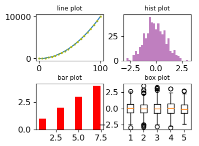
2️⃣ 데이터시각화 - Seaborn
Seaborn은 Matplotlib 기반의 고급 시각화 라이브러리다. 스타일이 더 예쁘고, 범례·색상·통계 기반 그래프가 쉽게 구현되는 것이 특징이다.
1. 바 그래프 그리기
df33 = df2.groupby('Gender')['Customer ID'].count().reset_index()

# 그래프 그리기
p = ["#F4D13B","red"]
sns.set_palette(p)

plot1 = sns.barplot(data=df33, x="Gender", y="Customer ID")
plot1.bar_label(plot1.containers[0], labels=df33['Customer ID'], fontsize=7, color='green')
plot1.set_title("User - bar chart")
bar_label을 통해 막대 위에 숫자를 넣어줄 수 있다.
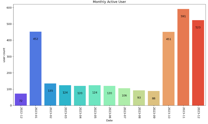
2. Bar Chart - 날짜 데이터 기반
# Timestamp 데이터 필터링
mask2 = (df3['Time stamp']>' ')
df8 = df3[mask2]

# 문자열 날짜를 datetime으로 변환해서 "YYYY-MM" 만 추출
df8['Date'] = pd.to_datetime(
    df8['Time stamp'], format='%d/%m/%Y %H:%M'
).dt.strftime('%Y-%m')

# 월별 유저수 집계
df9 = df8.groupby('Date')['user id'].count().reset_index()
df9.rename(columns={'user id':'user count'}, inplace=True)

# 그래프 그리기
plt.figure(figsize=(15, 8))
dplot1 = sns.barplot(x="Date", y="user count", data=df9, palette='rainbow')
dplot1.set_xticklabels(dplot1.get_xticklabels(), rotation=270)

for p in dplot1.patches:
    height = p.get_height()
    dplot1.text(
        x=p.get_x()+(p.get_width()/2),
        y=height-50,
        s='{:.0f}'.format(height),
        ha='center'
    )
3. Count Plot
plt.figure(figsize=(6, 5))
sns.countplot(x='Category', hue='Gender', data=df2, palette='cubehelix')- countplot 은 y값을 자동으로 갯수(count)로 계산해줌
- hue 로 성별을 나누면 범례도 자동 생성
'Data_10기' 카테고리의 다른 글
| [기초프로젝트] 3일차 - 데이터 전처리 (0) | 2025.11.21 |
|---|---|
| [기초 프로젝트] 2일차 (0) | 2025.11.20 |
| 데이터 전처리 & 시각화 - 결측치, 이상치 (0) | 2025.11.18 |
| 데이터 전처리 & 시각화 - merge, concat, lamda / split / rrule (0) | 2025.11.17 |
| 데이터 전처리 & 시각화 - EDA 기초 정리 (0) | 2025.11.14 |